Tuesday, December 14, 2010

FinaL


For our final project, we decided to display a tri-fold with all different aspects of our visual communications class this semester.  We are trying to achieve a beginning understanding of what this course entitles, and to give students who are interested in a visual communications major or minor a preview of what is to come. 

We first created three pie graphs, all displaying the same data.  We did this purposely to show what a good pie graph looks like, a decent one, and a perfect one.  The three graphs display how this course, can help communications students better visualize and display their thoughts more clearly. 

Next we decided to display a mind map, because we thought this is one of the best brainstorming activities.  For the holidays we decided to display a mind map with Christmas located in the middle cloud.  For interested visual communications students, this is an activity that will get their brains to start flowing with ideas.

On the far right side of our poster, we displayed a flow chart that gives detailed instructions on how to change your major or minor to communications.  Not only does this give a detailed, straightforward set of directions, it also appears to be the last piece to be looked at.  We decided to place it at the end, so that if students have become interested in a major or minor in communications, they will know exactly how to switch their major. 

On the top left side of our poster we decided to show different type of bar graphs to show our persona the statistics about the program but also something else they will learn in this class. The statistics provided will help the student with how many people are in the program, how many are men and women and how many stay in the program or drop out of it later in college.
For this final presentation we sat down and brainstormed the many ideas that we learned in this class through the semester and chose the main ideas that stood out to us the most from the semester. When choosing the ideas we placed them in a controlled collage and then put the most important if the student would want to transfer at the end. We decided to put a giant mind map in the middle of the poster because we all thought that this was the most important idea we absorbed from the course.

My personal experience with this project was pretty satisfying.  The first time my group sat down, we agreed that having a giant poster board with aspects of visual communications on it would be most appropriate.  I think the actually design of how we laid out the different aspects was interesting, because the project ended with a flow chart that instructed the viewer to go out and change their major or minor to communications.  

Monday, December 6, 2010

Multivariate

For my multivariate display I chose to take statistics from the original "Big 3" that was assembled to play for the Boston Celtics some years ago.  I wanted to tell the story of why these 3 players work so well together, by showing some of there statistics for this current season.  My three variables were the 3 players: Paul Pierce, Kevin Garnett, and Ray Allen.  For each I looked up there statistics to date, and displayed it in a line graph, using different symbols and colors to differentiate the players statistics.  My main goal in this display was to show how even these players stand out when lined up together on a simple graph.  As you can see the three lines virtually look as if they are one.  This shows that each player is making a solid contribution at each and every one of these 4 categories.  It shows how well rounded each player is to be able to contribute on both the defensive end and the offensive.  The story here ends hopefully with the Boston Celtics hanging there 18th banner later on in the season.  (seeing as these are current statistics)

Thursday, November 25, 2010

StoryBoards.


For my first storyboard, I decided to choose the little girl who in my case, looks as if she is lost and looking for her parents.  I basically began my story with 2 parents holding a picture of their missing child.  Then using the scene-scene method, I moved forward in time and showed the police out in the woods looking for the missing girl.  Then I used the picture on the Comm165 site of the little girl, as if the police had found her in a new scene.  Then i topped it all off with a happy family who had just found their missing child.  This first storyboard was interesting, because I couldn't really figure out a story for this little girl, until i came up with the fact that she may be lost.  From Schriver's Model, I used scene-scene for both my storyboards as a matter of fact.  I actually didn't have this planned, but both my stories skip between time frames, and scenes for each individual frame.  This does take out details from the story, but also makes this simple to understand and interpret.  


For my second storyboard, I chose to use the kids covering themselves, so they don't get hit by a soccer ball photo, and the man praying.  I figured I could tie these together easily, especially if I make the man praying the kids soccer coach.  Here I also used scene-scene as i mentioned before, because it starts at the penalty kick, then it shows the kids bracing themselves, or playing defense.  Although this is almost a slow motion storyboard, it does skip from scene to scene.  After the kids are shown, the storyboard goes to a clip of the coach praying the penalty kicker misses, and then the next frame shows the opposing team score.  It's actually sort of a sad storyboard, because all the characters in it actually lose this soccer game in the end.  

Monday, November 15, 2010

Charts & Graph


For this assignment I found some information on the rwu.edu site that involved enrolling facts here at Roger Williams University.  For this table I thought a bar graph displaying each different category would be most appropriate. I thought the information all related, because you could actually see how many students are attending our school, and how big each class actually averaged out here.  For me it showed me that it looks like this is a school where the student to professor relationships would be much more substantial than a school where the average student to professor rating may be 100:1.  These statistics are key bits of information that are posted on the roger williams website, for a reason.  People want to know what they are getting, especially when they are choosing an undergraduate college. 

Working with excel and powerpoint to construct these tables and graphs was pretty easy for me.  Over the past summers I have been working for a help desk at a company called American Tower.  Here a lot of the time i was working directly with excel and powerpoint to either keep records, or set up mailing lists.

Sunday, November 7, 2010

FloW ChaRts


The two flow charts, I kind of enjoyed drawing up.  For this assignment, I went to amazon.com and google.com, and went through the process of each, while creating the flow charts simultaneously.  I’m sure this is what most people had to do, seeing as I haven’t purchased a book from Amazon in some time.  I feel like purchasing a book required more steps than the research through Google Scholar.  This was because to actually purchase one or more books, you had to add them to your cart, and then fill out payment information.  For the research, once you find what you are looking for, minus citation information, you’re all set.  It was easy to search in a google bar and click a link and browse for research.  It required fewer steps.  I think flow charts can be a great way to help people navigate websites.  And it would work great for someone not familiar with the internet, but are literate. 
            My pictures came out a little blurry, my camera is waterlogged, and i had to use Photobooth to photograph these.  Sorry for the inconvenience.  


How To SPaghetti


For the “How To” create a spaghetti dinner, I wanted to simplify the steps, without making it to complex to see what was going on.  Seeing as we couldn’t use words for describing, minus the labels on the food products, this task was going to be a bit more difficult than I thought.  For some reason when I was doing this assignment I naturally showed also how to make meatballs, because for me there is no spaghetti without the meatballs.  After I was finished with this assignment I quickly realized that nobody else had shown meatballs being made with the spaghetti.  I also realized I didn’t have a strainer in my design, which is a key step missing, but if they read my visuals correctly, you can tell the water has vanished after being taken out of the pan.  I figured if I put a nice big final product, people would know exactly what they were going for, immediately after viewing the visual.  It was a tough assignment, because without words, it’s hard to draw directions for a process as simple as making spaghetti.  


Thursday, October 28, 2010

LAwncare


Basically this was a tough assignment.  I tried re-reading the lawn care article online until i could figure it out, and I still am not sure this is correct.  I used arrows connecting each symbol until it reached its final stage, where whether you would use one product or another, or in one case no product.  I used a thermometer to display whether or not the temperature was above or below 90 degrees, and clouds with rain to show whether it was raining, with an up arrow, or it wasn't with a down arrow.  Same with the insects, up arrow to display insects are prevalent, and down arrows to display the opposite. My first draft wasn't drawn out with arrows, rather a table - ish type method.  I tried to get away from it, not knowing how effective it actually could have been.  

Thursday, October 7, 2010

Collage

Concept Map # 2


Concept Map - Winter

For my second sketch I ended up doing a concept map that surrounded the word Winter.  I had a lot of fun with this one as well, because a couple times i got stuck and had to get up and walk away from my sketchbook, only to come back later when my brain started visualizing the final piece.  I was trying to acheive a definition of winter through examples of things anyone would do during this season.  Winter is one of my favorite seasons, so after i was done, I thought it really incorporated a lot of the season. 

I haven't posted my first sketches for my mindmap or my concept map yet, but I will once I get them uploaded.  My first sketch of the concept map was similiar to this one but I only had three branches coming off winter, and too much empty space.  I also enjoyed sketching this piece, and when i finished I thought the final piece came out pretty well.

First Draft

Mind Map # 1


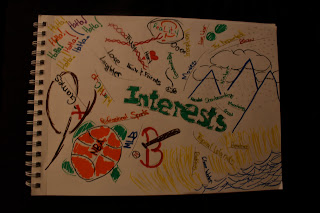
Mind Map - Interests

I did my first sketch (mindmap) on my interests which ranged from watching sports on the television to pumping my adrenaline while snowboarding.  This was an expereience because as you walk away from your sketch and come back to it, your brain has time to breathe and the final piece comes out great.  When walking away you have time to get your brain going again, instead of just filling empty space, every idea comes to life.  It seemed like an assignment that required patience, and fortuantley I possess that virtue.  It was more of a fun assignment rather than a 12 page paper. 


Although these are not all my interests, I think the mindmap came out pretty could, and spontaneous, which is a word my friends describe me as all the time.  It was a good first experience in this class, and first experiences say a lot.  Hope you guys enjoy my blog! Peace.  My first draft is below.